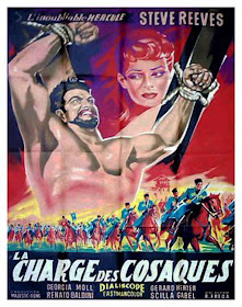
For a change, I'm showing 3 different posters for THE WHITE WARRIOR, just for comparison:
French poster. They made Steve Reeves look big and a bit crazy.
US insert poster. I like the over-the-top aspect of this one.
Belgium poster. More "realistic" than the two above but Steve looks too ordinary. The woman on the top right corner doesn't look like anyone in the film.


I like the Belgian poster the most because it is more realistic.
ReplyDelete